[Next.js] vanilla-extract 기본 사용법
ReactNext.jsVanilla-ExtractCSS
Next.js를 공부하면서 스타일시트로 vanilla extract를 즐겨 사용하고 있습니다. 사용할 때마다 매번 찾아보기 귀찮아서 세팅 방법과 간단한 사용법을 정리 해두었습니다.
Install
npm install @vanilla-extract/css
Next.js 사용 시 필요한 추가 플러그인 설치 및 next.config 파일 수정
npm install --save-dev @vanilla-extract/next-plugin
// next.config.ts
import type { NextConfig } from "next";
import { createVanillaExtractPlugin } from "@vanilla-extract/next-plugin";

const withVanillaExtract = createVanillaExtractPlugin();

const nextConfig: NextConfig = {
  /* config options here */
};

export default withVanillaExtract(nextConfig);
글로벌 스타일, 테마 적용
import {
  createGlobalTheme,
  globalFontFace,
  globalStyle,
} from "@vanilla-extract/css";

export const vars = createGlobalTheme(":root", {
  colors: {
    grey: {
      50: "hsl(265, 55%, 96%)",
      100: "hsl(265, 19%, 88%)",
      200: "hsl(265, 7%, 70%)",
      300: "hsl(265, 6%, 66%)",
      400: "hsl(265, 4%, 57%)",
      500: "hsl(265, 3%, 53%)",
      600: "hsl(265, 4%, 42%)",
      700: "hsl(265, 4%, 31%)",
      800: "hsl(276, 5%, 20%)",
      900: "hsl(280, 5%, 13%)",
    },
    primary: {
      50: "#c8b3ce",
      100: "#a07aaa",
      200: "#884c97",
      300: "#843897",
      400: "#732392",
      500: "#5a097a",
      600: "#480264",
      700: "#3d0264",
    },
    success: {
      100: "#a2f0bc",
      500: "#12bd4b",
    },
    error: {
      100: "#f1acc9",
      500: "#a10c4a",
    },
  },
  sizes: {
    1: "0.25rem",
    2: "0.5rem",
    3: "0.75rem",
    4: "1rem",
    5: "1.25rem",
    6: "1.5rem",
    8: "2rem",
    16: "4rem",
    20: "5rem",
    40: "10rem",
  },
});

globalStyle("*", {
  boxSizing: "border-box",
});

globalStyle("body", {
  margin: 0,
  backgroundColor: vars.colors.grey[500],
  color: "#252525",
  fontFamily: '"BookkMyungjo-Bd"',
});

globalFontFace("BookkMyungjo-Bd", {
  src: 'url("https://fastly.jsdelivr.net/gh/projectnoonnu/noonfonts_2302@1.0/BookkMyungjo-Bd.woff2") format("woff2")',
  fontWeight: "700",
  fontStyle: "normal",
});

globalStyle("a", {
  textDecoration: "none",
});

globalStyle("button", {
  fontFamily: "inherit",
  cursor: "pointer",
});
프로젝트 루트 컴포넌트에 해당 스타일 파일 import
// _app.tsx
import Layout from "@/components/layout/layout";
import "@/styles/globals.css";
import type { AppProps } from "next/app";

export default function App({ Component, pageProps }: AppProps) {
  return (
    <Layout>
      <Component {...pageProps} />
    </Layout>
  );
}
기본 사용법
1. 스타일 객체 생성 및 export
// button.css.ts
import { style } from "@vanilla-extract/css";
import { vars } from "@/styles/globals.css";

export const button = style({
  padding: 10,
  color: vars.colors.primary[50],
  fontSize: 20,
});
2. 사용할 곳에서 import 및 객체 접근
// button.tsx
import * as styles from "./button.css";

export default function Button() {
  return <button className={styles.button}>Button</button>;
}
3. selectors, media query
Selectors
// button.css.ts
import { style } from "@vanilla-extract/css";
import { vars } from "@/styles/globals.css";
export const button = style({
padding: 10,
color: vars.colors.primary[50],
fontSize: 20,
// selectors
":hover": {
backgroundColor: "red",
},
// or
selectors: {
"&:active": {
color: "blue",
},
"nav li > &": {
color: "green",
},
},
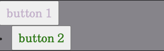
});// button.tsx
import * as styles from "./button.css";
export default function Button() {
return (
<div>
<button className={styles.button}>button 1</button>
<nav>
<li>
<button className={styles.button}>button 2</button>
</li>
</nav>
</div>
);
}
4. Media query
// button.css.ts
import { style } from "@vanilla-extract/css";
import { vars } from "@/styles/globals.css";

export const button = style({
  // ...

  "@media": {
    "(max-width: 768px)": {
      fontSize: 10,
    },
  },
});
5. 스타일 확장
// buttons.css.ts
import { style } from "@vanilla-extract/css";

const baseButton = style({
  padding: 10,
});

export const primaryButton = style([
  baseButton,
  {
    color: "red",
    backgroundColor: "blue",
  },
]);

export const secondaryButton = style([
  baseButton,
  {
    color: "blue",
    backgroundColor: "pink",
  },
]);
그 외에도 여러 기능들이 많지만 최소한으로 필요한 간단한 사용법만 정리 해두었습니다. 더 학습해보다가 추가 할 것이 있다면 추가 할 예정입니다🫡